


Web Design Trends for 2026: What Makes a High-Converting Website Today

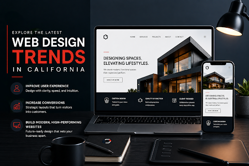
Chase every new visual trick, and you'll still lose visitors if they can't figure out what you're offering. That's the whole point behind Modern web design trends 2026: clarity, mobile use, speed, trust, and whether someone actually takes action, not whatever's fashionable this year.
A polished design earns a good first impression. A useful one keeps people moving past that first impression. The sites that actually convert in 2026 aren't the ones stacked with effects; they're calm, and they guide people from curious to decided without much friction.
The Biggest Trend Is Less Confusion
Forget colour palettes for a second. The real shift is stripping out anything that makes a visitor pause, guess, or bail.
Take a dental clinic with gorgeous branding and polished photos; none of that matters if someone can't find the services list or book an appointment in under ten seconds. A layout worth calling "strong" answers a few things before doubt even has a chance to build:
What the brand actually offers.
Who is it meant to help?
Why it deserves trust.
What to do next.
How to contact or buy without extra effort.
Fewer things to figure out usually means more people stick around.
Trend 1: Clear Above-the-Fold Messaging
That first screen carries a lot of weight. Nobody should have to scroll just to understand what a business does.
A section that pulls its weight has a simple headline, one short supporting line, a single clear CTA, and enough trust proof – a review, a result, something real to back it up. Nothing crowded, no competing buttons fighting for attention. The point isn't cramming everything in at once. It's making the next step obvious.
Trend 2: Mobile-First Layouts That Feel Natural
Most people meet a brand on their phone first, and a cramped or sluggish layout loses them before they've even read the offer.
That's the whole reason web design trends in California are drifting toward cleaner mobile structures:
Menus that open without a fight.
Buttons big enough to actually tap.
Forms that don't feel like homework.
Text spacing that doesn't cramp the eye.
Scrolling that feels smooth, not sticky.
Mobile shouldn't be a shrunk-down desktop site. It should be built for how people genuinely use a phone.
Trend 3: Conversion Paths With Fewer Steps
Good conversion-focused web design tips tend to be almost boringly simple: cut the friction, cut the choices, and make the action obvious.
That means shorter forms, click-to-call buttons that actually work on mobile, and CTAs sitting right where someone's about to decide. An online store might have gorgeous product shots, but a clunky checkout or vague shipping info will still send people elsewhere. Small annoyances add up fast.
Trend 4: Trust Signals Placed Where Doubts Appear
Trust shouldn't live only in a footer nobody scrolls to. It needs to show up exactly where someone hesitates, right as they're wondering if this business is legit.
Signals worth placing near those moments:
Reviews are sitting close to the enquiry buttons.
Case studies near the relevant service.
Real project photos, not stock ones.
Team bios or faces.
Certifications, where relevant.
Honest guarantees or support notes.
Forced trust feels forced. Natural placement doesn't.
Trend 5: Faster, Lighter Visual Experiences
Big, heavy visuals look impressive for about five seconds, then they slow everything down. Too many effects and crowded sections just make people impatient.
A fast site feels effortless, from headline to gallery to form, no waiting around. Lighter doesn't mean plain. It means every visual is actually doing something.
Trend 6: Design That Feels Personal, Not Generic
So many sites blur together because they're built on the same templates and the same stock photography. What stands out in 2026 is design that actually feels specific to the brand behind it.
For California businesses, business website design trends in California mean:
Local relevance baked into the copy.
Real photos instead of borrowed ones.
Clear service areas.
Messaging that matches what the customer actually expects.
A law office and a neighbourhood restaurant shouldn't read like the same website with different logos.
Trend 7: Accessibility and Easy Reading
Easy reading benefits literally everyone, not just a niche group. A site should hold up across different devices and different browsing situations without extra effort from the visitor.
Worth checking:
Colour contrast that's actually readable.
Font size that doesn't strain the eye.
Button labels that say something useful.
Simple, short forms.
Alt text on meaningful images.
Enough breathing room between sections.
Good design shouldn't feel like work.
What Makes a Website High-Converting in 2026?
For anyone chasing high-converting website design in California, the answer keeps coming back to the same three things: clarity, trust, and smooth movement from one step to the next.
A site that actually converts usually has a clear headline, fast load times, simple navigation, visible CTAs, and a consistent message that doesn't waver page to page. Everything nudges the visitor toward calling, booking, or buying.
Trends California Businesses Should Avoid
Not every trend earns its keep. Some just look interesting while quietly making the site harder to use.
Skip these where possible:
Too many animations.
Menus that hide instead of guide.
Vague, clever-but-empty headlines.
Long forms shown too early.
Cold, obviously stock photography.
Pop-ups before any trust is built.
Slow, image-heavy pages.
If a trend doesn't make the visitor's job easier, it's not worth the effort.
A Practical 2026 Redesign Checklist
Before touching a redesign, look at the site the way a stranger would. Is the message clear within a few seconds? Can someone find the main action fast? Does mobile actually feel smooth, or just technically functional? Are the forms short? Are reviews sitting anywhere near the decision point? Running through questions like these separates the choices that matter from the ones that are just decoration.
Final Thoughts
Trends should support the visitor, not distract from them. What holds up in 2026 is clear, fast, and genuinely built around trust rather than decoration.
A site that converts doesn't need to feel busy or overdesigned. It just needs to help someone understand the brand and feel ready to take the next step. For brands wanting a clearer, faster, more conversion-focused presence, Generational Marketer can help shape that around trust, usability, and growth.


Comments